Views: 222 Author: Tomorrow Publish Time: 12-16-2025 Origin: Site


Content Menu
● The Rise and Appeal of Laundry Pods
● The Safety Problem: A Hidden Hazard
>> Accidental Poisonings and Injuries
>> Toxic Effects and Medical Consequences
● The Design Dilemma: Safety Versus Branding
>> Color Psychology and Consumer Marketing
>> Industry Resistance to Change
● Efforts Toward Safer Packaging
>> Regulations and Industry Standards
>> Packaging Innovation Examples
● Designing for Safety: Practical Alternatives
>> Non-Edible Shapes and Textures
>> Educational Symbolism and Branding Adjustments
● The Ethical Argument: Responsibility Over Profit
>> Corporate Social Responsibility (CSR)
>> Balancing Marketability With Morality
● The Role of Public Awareness
● Broader Implications for Product Design
● The Future of Safe Cleaning Solutions
● FAQ
>> 1. Why do laundry pods look like candy?
>> 2. What are the dangers of ingesting a laundry pod?
>> 3. What preventive actions have companies taken?
>> 4. How could redesigning pods improve safety?
>> 5. What can consumers do to minimize risks?
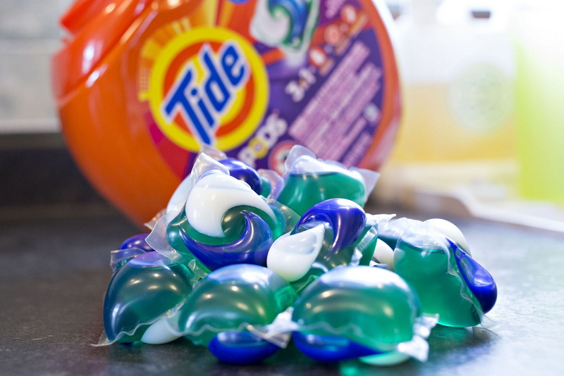
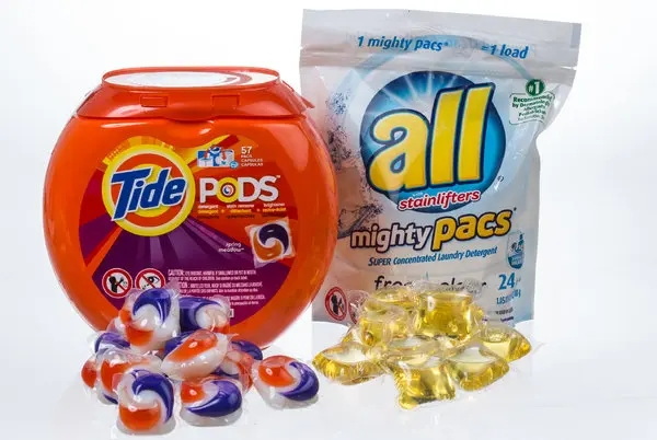
Laundry pods have redefined modern cleaning habits with their compact, pre-measured, and efficient design. They are marketed as a convenient solution to messy laundry detergents, allowing people to simply toss one into the washing machine without measuring or spilling liquids. However, this same simplicity conceals a serious design problem: laundry pods look remarkably like candy. Their bright colors, shiny coatings, and jelly-like textures make them visually appealing—especially to children and cognitively impaired adults.
This observation raises an urgent question that extends beyond marketing or manufacturing: why not make laundry pods look less like candy? It is not just a matter of product design; it concerns ethics, psychology, public safety, and corporate responsibility. The following sections explore how laundry pod aesthetics evolved, the dangers they pose, and practical measures industry and society could adopt to reduce risks.

When laundry pods first hit the market in the early 2010s, they revolutionized detergent use. The main idea was to simplify laundry while ensuring optimal detergent doses. Inside each pod, a water-soluble film encases highly concentrated cleaning agents—detergent, softener, and stain-removing enzymes—creating a self-contained cleaning capsule that dissolves entirely in water.
From a consumer standpoint, the appeal was instant. No spills, no guesswork, no mess. In addition, the pods' colorful gels not only looked fresh but also differentiated product types—blue for “deep clean,” green for “eco-friendly,” purple for “lavender scent,” and so on. These hues aligned with marketing trends that associate color and cleanliness, prompting stronger shelf visibility and brand recognition.
But, from another perspective, these same design cues blurred a critical boundary: detergent began resembling food. Many adults have noted that certain pods look like fruit-flavored gummies, bubble candies, or even chewy mints. That similarity is not lost on children, who explore the world largely through touch and taste.
Not long after laundry pods gained popularity, hospitals and poison control centers began reporting a wave of accidental ingestion cases. According to the U.S. Centers for Disease Control and Prevention (CDC), thousands of children under age 6 are exposed to laundry detergent pods each year. Between 2012 and 2017 alone, poison control centers in the United States handled over 70,000 pod-related exposure cases involving young children.
The problem is global. In the United Kingdom, similar incidents prompted government concern and consumer education campaigns. Parents often describe how quickly an accident can occur: a child sees a bright pod on the counter, assumes it's candy, and pops it into their mouth before an adult can react.
Older adults with dementia or vision impairments are also at risk. Many incidents among senior populations occur when individuals mistake detergent pods for snack packs, throat lozenges, or gum.
Laundry pods contain concentrated chemicals such as surfactants and solvents that, when ingested, can cause chemical burns in the mouth and esophagus, vomiting, respiratory distress, or even life-threatening breathing difficulties. Eye contact can result in corneal injury, while skin contact may cause irritation or allergic reactions.
Because the detergent is highly concentrated, even a small amount can have serious effects compared with exposure to diluted liquid or powder detergents. The outer membrane, designed to dissolve quickly in water, can burst easily when bitten or squeezed, directly releasing the chemical solution.
The design question isn't simply about making something “look pretty.” It's about how colors and shapes influence user behavior—sometimes in unintended ways.
Manufacturers rely heavily on color to communicate brand identity and product type. In marketing psychology, bright colors attract attention, stimulate emotional connection, and convey cleanliness or freshness. For example, blue is commonly associated with cleanliness, while green evokes eco-friendliness.
However, young children interpret those signals differently. To them, bright colors usually indicate sweetness and playfulness, not cleaning efficiency. The result is a dangerous mismatch between intended design language and perceptual interpretation.
Despite widespread awareness of ingestion risks, most laundry pod manufacturers maintain the same general design. There are several reasons:
1. Brand recognition: Companies prefer to preserve their established aesthetic appeal. Their iconic swirled colors instantly signal product type and brand identity.
2. Consumer preference: Market research shows adults perceive colorful pods as “stronger” or “more effective,” which fuels continued demand.
3. Economic and logistical costs: Reformulating pod appearances requires redesigning manufacturing lines, retesting product safety, and possibly rebranding—processes that are costly and time-consuming.
4. Voluntary compliance: Government regulations have primarily focused on packaging, leaving color and form largely unregulated.
In other words, colorful design has economic benefits that outweigh perceived risks from a corporate perspective, even though these design choices increase public health hazards.
In response to rising poisoning rates, government agencies and safety organizations have stepped in. In the U.S., the Consumer Product Safety Commission (CPSC) collaborated with the American Cleaning Institute (ACI) to develop voluntary safety standards. These guidelines promoted:
- Child-resistant containers with secure latches.
- Opaque packaging to obscure pod visibility.
- Prominent warning labels highlighting the toxic nature of the product.
- Public awareness campaigns urging safe storage.
While these measures have reduced access, they do not address the root cause—the pods themselves still look edible once removed from the packaging.
Some brands experimented with less transparent containers, dimmer color schemes, or labeling that emphasizes hazard icons. Others introduced polyvinyl alcohol (PVA) films embedded with bittering agents, producing a foul taste when bitten. These strategies moderately deter ingestion but still stop short of solving visual temptation.

To make laundry pods look less like candy, design must embrace functionality alongside deterrence. Several practical solutions have been proposed by researchers and designers.
Switching to dull, opaque shades minimizes resemblance to confectionery. Pale or grayish tones communicate seriousness and industrial function instead of playfulness. Neutral coloring could also help reduce appeal while still allowing differentiation through subtle labeling.
Most pods are smooth and round, shaped similarly to gumdrops. Redesigning them into angular or block-like structures could reduce confusion. Textural changes—such as matte finishes—could make them look more like cleaning tablets rather than squishy treats.
Manufacturers could imprint phrases like “DO NOT EAT” or skull icons into the pod's outer film. Such visible warnings reinforce safety even when pods are removed from packaging. Combined with neutral coloring, this approach embeds safety messages directly into the product.
Adding bitrex (denatonium benzoate), one of the most bitter substances known, creates a last-resort safety barrier. Though it does not prevent initial contact, it ensures that anyone tasting a pod immediately spits it out, reducing the likelihood of swallowing.
Advertising plays a major role in perception. By eliminating candy-like visuals from commercials and packaging, companies can break the subconscious connection between detergent and food. Rebranding messages could emphasize technology, hygiene, or environmental benefits rather than sensory appeal.
Beyond design and engineering, the debate touches deeply on ethics. Corporations owe their consumers more than effective cleaning—they owe them safety and transparency. When product designs capitalize on visual allure at the cost of child safety, ethical accountability becomes unavoidable.
Most multinational detergent brands publicly pledge to uphold CSR principles. Making pods less candy-like would be a direct reflection of those values. Ethical design prioritizes human well-being. Aesthetic choices should never endanger consumers, particularly those unable to understand associated risks.
The transition toward less visually appealing detergents may temporarily affect sales or brand identity, but the long-term benefits—fewer poisonings, better brand reputation, and trust from consumers—outweigh short-term drawbacks. Consumers increasingly reward brands that align design with ethics.
Design changes alone cannot prevent every accident. Education is essential. Parents and caretakers play a critical role in preventing exposure. The following safety practices can reduce household risks:
- Store laundry pods in locked cabinets or on high shelves.
- Avoid transferring pods into non-original containers.
- Teach children to recognize warning labels and avoid touching cleaning supplies.
- Always close packaging immediately after use.
Public campaigns on television and digital platforms can further enhance awareness. Short videos demonstrating proper storage and potential dangers have proven highly effective. Pediatricians and community health programs could collaborate to distribute flyers and online resources, reinforcing key messages among families.
Laundry pods are not the only consumer products with appearance-related hazards. Other categories—such as dishwasher tablets, vape liquids, and colorful disinfectants—pose similar visual risks. Industries can learn from this example. The broader lesson: if a product is toxic, it should look toxic.
Design professionals increasingly adopt *behavioral safety design*, integrating psychological research into visual presentation. The principle is simple: form should signal function truthfully. Making dangerous products look attractive undermines this balance. The same applies to cleaning chemicals, batteries, and even compact medication packaging.
Technological innovation may soon enable safer alternatives without compromising effectiveness. Emerging trends include:
- Biodegradable neutral films: Transparent yet colorless outer layers that dissolve easily while reducing aesthetic temptation.
- Smart labels and QR codes: Enabling quick access to safety information through mobile scanning.
- AI-driven design modeling: Predicting consumer perception of color and shape across demographics before launching new products.
In a future where environmental sustainability and safety intersect, visual simplification will likely replace glossy, high-contrast marketing in household products. A safer, minimalist approach can modernize detergent branding without making it resemble candy.
The question *“Why not make laundry pods look less like candy?”* challenges an entire industry to reconsider the intersection of convenience, marketing, and safety. Laundry pods are a brilliant innovation that simplified daily chores, but their aesthetic resemblance to candy created a global safety hazard. Preventable poisonings continue to occur, revealing that current measures—opaque packaging and warnings—are insufficient.
Real progress requires collective responsibility: manufacturers must prioritize ethical design, regulators must strengthen standards, and consumers must remain vigilant. Redesigning pods with neutral colors, angular shapes, warning imprints, and deterrent coatings is both feasible and morally necessary.
Safety should never compete with style. By removing the candy-like appeal, the industry can protect its users—especially the most vulnerable—while maintaining functionality and trust.

Laundry pods are designed with bright colors to attract consumers and differentiate product types. Unfortunately, this marketing approach makes them look similar to gummies or other candies to young children and older adults.
Laundry pods contain concentrated cleaning chemicals such as surfactants and solvents. Ingestion can cause burns, vomiting, respiratory problems, and, in severe cases, hospitalization. Even eye or skin contact can cause irritation.
Manufacturers have implemented child-resistant packaging, opaque containers, and bitter coatings. However, most companies have not substantially altered the pods' colorful appearance.
Neutral colors, angular designs, and embedded warnings can drastically reduce their resemblance to food, preventing accidental ingestion while preserving effective cleaning performance.
Keep pods in original packaging, store them high and out of reach, and educate household members—especially children—about their dangers. Awareness and proper storage are key to preventing accidents.
Laundry Pods vs. Liquid Detergent: Which Is the Right Choice for Your Laundry?
How to Use Laundry Pods Correctly: Expert Insights from a Leading Laundry Pods Manufacturer in China
Top 10 Detergent Brands in The World (2026) – And How OEM/Private Label Brands Can Compete
The Ultimate Guide to Using Laundry Pods Effectively: Insights from a Leading OEM Manufacturer
Why Global Brands Now Prefer Laundry Pods – Insights From Our OEM Factory in China